
US Fatality Data Shows The Best Places To Focus Your Safety Efforts
Ok, I have a confession to make…I’m a data dork. I love poring through data and seeing how it helps make sense of the world. You have no idea how often I’ve made my co-workers’ eyes roll into the back of their heads when I’ve uttered, “I found a bunch of interesting data on the topic of XYZ.” But, here goes. The Bureau of Labor Statistics has a treasure trove of data on worker fatality rates that can give some perspective and direction on where to focus our safety program efforts. Don’t let your eyes start rolling yet. The graphs are really interesting.
First up – fatal injuries by state. How did your state fare?

A Data-Driven Guide to Improving Workplace Safety
Download this eBook to learn the different types of safety data and best practices for using data and analytics to improve your safety program.
First up – fatal injuries by state. How did your state fare?
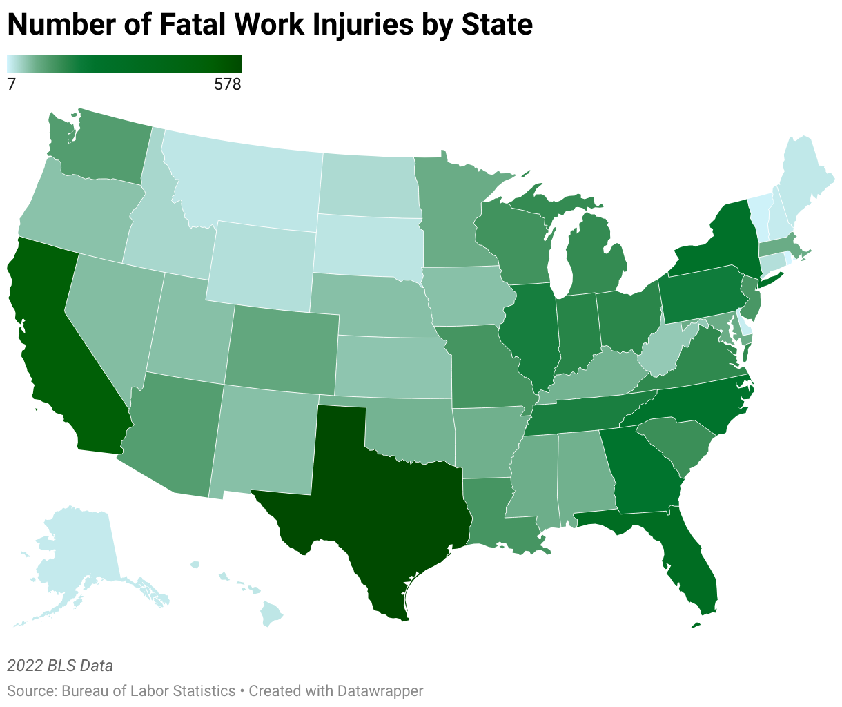
Population may have much to do with our map, so let’s look at this data a different way…fatal injuries by event.
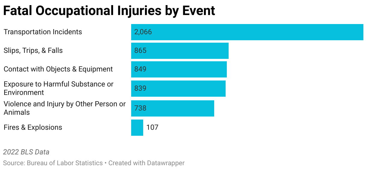
I’d recommend digging into BLS’s data more – you can dive into each of these groupings in more detail. You’ll learn, for example, that contact with objects fatalities are most often a “struck by objects” incident. Or that there were enough fatalities by animals and insects that they kept tally. Data dorkery aside, if we could cut down on driving accidents and falls to lower levels, we could help ensure everyone makes it home at the end of their shift.
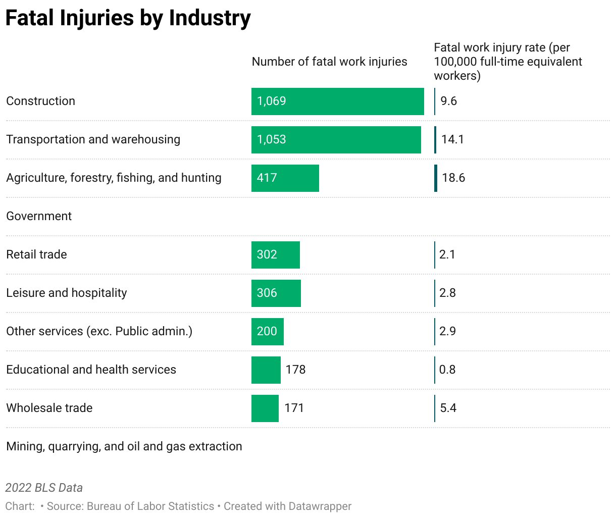
It’s always interesting to slice data by industry. Even more interesting is to take a look at the injury rate. Construction, not surprisingly, jumps to the top of the total fatalities, but agriculture takes the tops in injury rates.
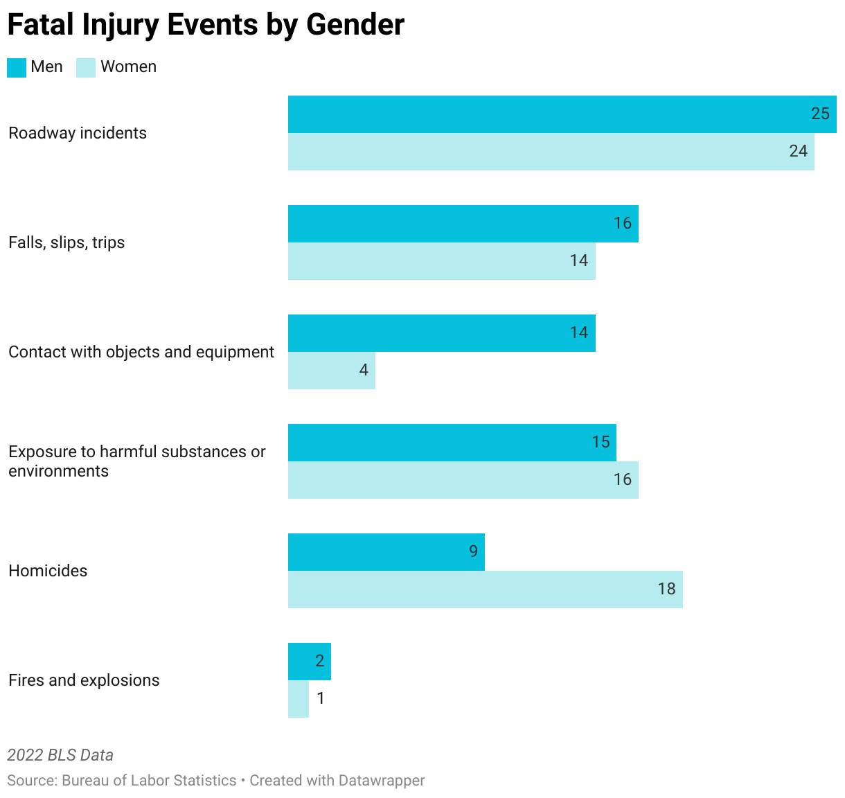
One last interesting way to slice this data was to look by gender. The two that make me particularly sad are the “contact with objects and equipment” affecting mostly men and “homicides” affecting mostly women.
Again, let’s do all we can to help as many people as we can make it home at the end of their shift. One great strategy to moving the needle on this is to look at the data to help us decide where to start.
Once you have decided where to start on your company’s journey, KPA is here to help.
Related Content
Explore more comprehensive articles, specialized guides, and insightful interviews selected, offering fresh insights, data-driven analysis, and expert perspectives.